
Style Guide
Styles and components used throughout the website
Typography
Typography plays a key role in shaping our brand’s visual identity and ensuring clarity and consistency across all communications. Our type choices reflect our brand’s personality and help guide users through content with ease and purpose. This section outlines the styles, hierarchy, and usage guidelines that maintain a cohesive typographic system across the web.
Key Best Practices
Headings
Common Use
Notes
H1
This is a heading
Main page title
Used once per page. Represents the primary subject or purpose of the page.
H2
This is a heading
Primary sections under the main title
Used to divide content into major thematic areas.
H3
This is a heading
Subsections within H2
sections
Useful for grouping related content under each major section.
H4
This is a heading
Sub-subsections
Helps break down complex content into smaller, scannable parts.
H5
This is a heading
Detailed subsections or nested content
Often used for minor details or less important headings.
H6
This is a heading
Least prominent headings
Rarely used; for deeply nested or auxiliary content.
Paragraph
Sed ut perspiciatis unde omnis iste natus error sit voluptatem accusantium doloremque laudantium, totam rem aperiam, eaque ipsa quae ab illo inventore veritatis et quasi architecto beatae vitae dicta sunt explicabo. Nemo enim ipsam voluptatem quia voluptas sit aspernatur aut odit aut fugit, sed quia consequuntur magni dolores eos qui ratione voluptatem sequi nesciunt. Neque porro quisquam est, qui dolorem ipsum quia dolor sit amet, consectetur, adipisci velit, sed quia non numquam eius modi tempora incidunt ut labore et dolore magnam aliquam quaerat voluptatem.
Quote
At vero eos et accusamus et iusto odio dignissimos ducimus qui blanditiis praesentium voluptatum deleniti atque corrupti quos dolores et quas molestias excepturi sint occaecati cupiditate non provident, similique sunt in culpa qui officia deserunt mollitia animi, id est laborum et dolorum fuga. Et harum quidem rerum facilis est et expedita distinctio.
Bulleted List
Buttons
Buttons are essential interactive elements that guide users toward actions and decisions. They serve as visual cues for tasks such as submitting forms, navigating pages, or initiating key interactions. Consistent button styles ensure a unified user experience and reinforce our brand’s visual language.
Primary
Highlights the main action on a page or section
Secondary
Offers an alternative or less prominent action
Reversed
Additional Applications
Text + Icon
Filled Icons
Button + Icon
Cards
Cards are versatile UI containers used to group related content and actions into a cohesive unit. They help organize information into digestible, scan-friendly blocks, making them ideal for displaying collections, previews, or summaries. Cards contribute to a clean, modular layout system that enhances usability and visual consistency across a digital product.
Text Cards
Wed May 21 3:00PM – 4:15 PM
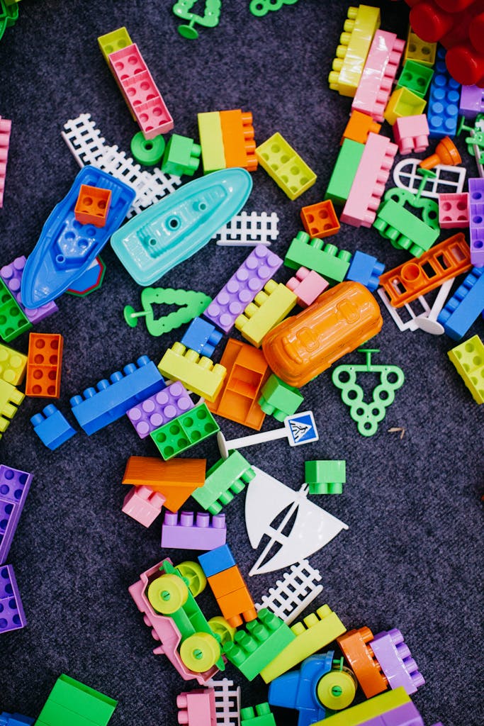
After School Dropin – Building with Lego Bricks
Join us and bring your imagination for a fun afternoon creating with our bricks! What will you design?
Wed May 21 3:00PM – 4:15 PM
After School Dropin – Building with Lego Bricks
Join us and bring your imagination for a fun afternoon creating with our bricks! What will you design?
Wed May 21 3:00PM – 4:15 PM
After School Dropin – Building with Lego Bricks
Join us and bring your imagination for a fun afternoon creating with our bricks! What will you design?
Cards with Images
Wed May 21 3:00PM – 4:15 PM
After School Dropin – Building with Lego Bricks
Join us and bring your imagination for a fun afternoon creating with our bricks! What will you design?

A blog article title goes here
Sed ut perspiciatis unde omnis iste natus error sit voluptatem accusantium doloremque laudantium lorem ipsum lor…

Caregivers Support Group
Caregivers Group welcomes anyone who is caring for someone. We help each other, listen, offer tips and information, blow off steam and laugh. And we often have guest speakers like Brooke Noonan from the Granite VNA.
Cards with Borders – Interactions
Wed May 21 3:00PM – 4:15 PM
After School Dropin – Building with Lego Bricks
Join us and bring your imagination for a fun afternoon creating with our bricks! What will you design?
A blog article title goes here
Sed ut perspiciatis unde omnis iste natus error sit voluptatem accusantium doloremque laudantium lorem ipsum lor…
Caregivers Support Group
Caregivers Group welcomes anyone who is caring for someone. We help each other, listen, offer tips and information, blow off steam and laugh. And we often have guest speakers like Brooke Noonan from the Granite VNA.
Solid Text Cards
Banners
Banners are prominent visual components used to communicate high-priority messages, calls to action, or contextual information. They capture user attention and are typically placed at the top of a page or within key sections to ensure visibility. Banners can be informative, promotional, or alert-driven, and should be used intentionally to avoid visual noise.
Banner with picture (Full width)
Strategic Plan 2025-2030 Unveiled
We are excited to share with you the library’s newly-launched strategic plan and new logo. Both the plan and logo were created based on community feedback gathered over the past year.
Banner with picture (Content Width)
Craft Swap
Give new life to your used – but reusable! – craft materials by swapping them with other crafters.
Solid Color Banner (Hero Color – Full width)
Find Out What’s Happening at the Library
The best way to stay informed with what is happening at the library is to sign up for our email updates and newsletters.
Solid Color Card (Color Palette Example – Content Width)
Strategic Plan 2025-2030 Unveiled
We are excited to share with you the library’s newly-launched strategic plan and new logo. Both the plan and logo were created based on community feedback gathered over the past year.
Media and text with Background
Art Students of the Moultonborough Academy
Our featured artists this month are the talented art students of the Moultonborough Academy.
Stop by our Program Room to see a fabulous display of art in different formats, created by local youth.


Friends’ House Tour 2025
The Friends of the Moultonborough Library invite you to a Moultonborough House Tour on June 11. Visit 5 beautiful homes between 9 am to 4 pm. Tickets are $40 per person, available for purchase from May 5 at the library or online.
Friends’ House Tour 2025
The Friends of the Moultonborough Library invite you to a Moultonborough House Tour on June 11. Visit 5 beautiful homes between 9 am to 4 pm. Tickets are $40 per person, available for purchase from May 5 at the library or online.
Media and text without background
Art Students of the Moultonborough Academy
Our featured artists this month are the talented art students of the Moultonborough Academy.
Stop by our Program Room to see a fabulous display of art in different formats, created by local youth.


Friends’ House Tour 2025
The Friends of the Moultonborough Library invite you to a Moultonborough House Tour on June 11. Visit 5 beautiful homes between 9 am to 4 pm. Tickets are $40 per person, available for purchase from May 5 at the library or online.
Secondary Hero Banners
Banners are prominent visual components used to communicate high-priority messages, calls to action, or contextual information. They capture user attention and are typically placed at the top of a page or within key sections to ensure visibility. Banners can be informative, promotional, or alert-driven, and should be used intentionally to avoid visual noise.
Banners with pattern
Home / Library History
Library History
The tell of how we came to be part of Moultonborough
Home / Arts, Music, & Movies
Arts, Music, & Movies
Explore engaging programs in visual arts, music, and film
Solid Banner
Home / Museum Passes
Museum Passes
Grow your knowledge with exciting visits
Clear Banner
Home / Ask a Librarian
Ask a Librarian
Accesible information just a click away
Additional Elements
Thanks to our defined typography, spacing, color palette, and component behavior guidelines, we can confidently adapt and style any UI element to fit seamlessly within our product. Whether it’s a collapsible FAQ section, a multi-step form, or a custom dropdown, every piece aligns with our visual identity and interaction principles.
Accordions
Accordion style 1
Lorem ipsum dolor sit amet, consectetur adipiscing elit, sed do eiusmod tempor incididunt ut labore et dolore magna aliqua. Ut enim ad minim veniam, quis nostrud exercitation ullamco laboris nisi ut aliquip ex ea commodo consequat. Duis aute irure dolor in reprehenderit in voluptate velit esse cillum dolore eu fugiat nulla pariatur. Excepteur sint occaecat cupidatat non proident, sunt in culpa qui officia deserunt mollit anim id est laborum.
Lorem ipsum dolor sit amet, consectetur adipiscing elit, sed do eiusmod tempor incididunt ut labore et dolore magna aliqua. Ut enim ad minim veniam, quis nostrud exercitation ullamco laboris nisi ut aliquip ex ea commodo consequat. Duis aute irure dolor in reprehenderit in voluptate velit esse cillum dolore eu fugiat nulla pariatur. Excepteur sint occaecat cupidatat non proident, sunt in culpa qui officia deserunt mollit anim id est laborum.

Lorem ipsum dolor sit amet, consectetur adipiscing elit, sed do eiusmod tempor incididunt ut labore et dolore magna aliqua. Ut enim ad minim veniam, quis nostrud exercitation ullamco laboris nisi ut aliquip ex ea commodo consequat. Duis aute irure dolor in reprehenderit in voluptate velit esse cillum dolore eu fugiat nulla pariatur. Excepteur sint occaecat cupidatat non proident, sunt in culpa qui officia deserunt mollit anim id est laborum.
Accordion Subtitle
Sed ut perspiciatis unde omnis iste natus error sit voluptatem accusantium doloremque laudantium, totam rem aperiam, eaque ipsa quae ab illo inventore veritatis et quasi architecto beatae vitae dicta sunt explicabo. Nemo enim ipsam voluptatem quia voluptas sit aspernatur aut odit aut fugit, sed quia consequuntur magni dolores eos qui ratione voluptatem sequi nesciunt. Neque porro quisquam est, qui dolorem ipsum quia dolor sit amet
Accordion style 2
Lorem ipsum dolor sit amet, consectetur adipiscing elit, sed do eiusmod tempor incididunt ut labore et dolore magna aliqua. Ut enim ad minim veniam, quis nostrud exercitation ullamco laboris nisi ut aliquip ex ea commodo consequat. Duis aute irure dolor in reprehenderit in voluptate velit esse cillum dolore eu fugiat nulla pariatur. Excepteur sint occaecat cupidatat non proident, sunt in culpa qui officia deserunt mollit anim id est laborum.
Lorem ipsum dolor sit amet, consectetur adipiscing elit, sed do eiusmod tempor incididunt ut labore et dolore magna aliqua. Ut enim ad minim veniam, quis nostrud exercitation ullamco laboris nisi ut aliquip ex ea commodo consequat. Duis aute irure dolor in reprehenderit in voluptate velit esse cillum dolore eu fugiat nulla pariatur. Excepteur sint occaecat cupidatat non proident, sunt in culpa qui officia deserunt mollit anim id est laborum.
Lorem ipsum dolor sit amet, consectetur adipiscing elit, sed do eiusmod tempor incididunt ut labore et dolore magna aliqua. Ut enim ad minim veniam, quis nostrud exercitation ullamco laboris nisi ut aliquip ex ea commodo consequat. Duis aute irure dolor in reprehenderit in voluptate velit esse cillum dolore eu fugiat nulla pariatur. Excepteur sint occaecat cupidatat non proident, sunt in culpa qui officia deserunt mollit anim id est laborum.

Accordion Subtitle
Sed ut perspiciatis unde omnis iste natus error sit voluptatem accusantium doloremque laudantium, totam rem aperiam, eaque ipsa quae ab illo inventore veritatis et quasi architecto beatae vitae dicta sunt explicabo. Nemo enim ipsam voluptatem quia voluptas sit aspernatur aut odit aut fugit, sed quia consequuntur magni dolores eos qui ratione voluptatem sequi nesciunt. Neque porro quisquam est, qui dolorem ipsum quia dolor sit amet
Accordion style 3
Accordion style 4
Forms
How your forms are styled.
Input Fields (Forms)
Ask A Librarian
Please use the form below to submit your question.
Subcribe Form
Subscribe to Our Monthly Newsletter
Banner + Form
Newsletter Signup
Stay up to date
On the Noticeboard
Executive Order Threatens Future of Inter-Library Loan and Downloadable Books
The future of some library services in New Hampshire are at risk following a Presidential Executive Order issued Friday, March 14, 2025 that calls for the reduction and elimination of functions of the Institute of Museum and Library Services (IMLS).